The Vanilla theme
Clean, warm, and photography-first
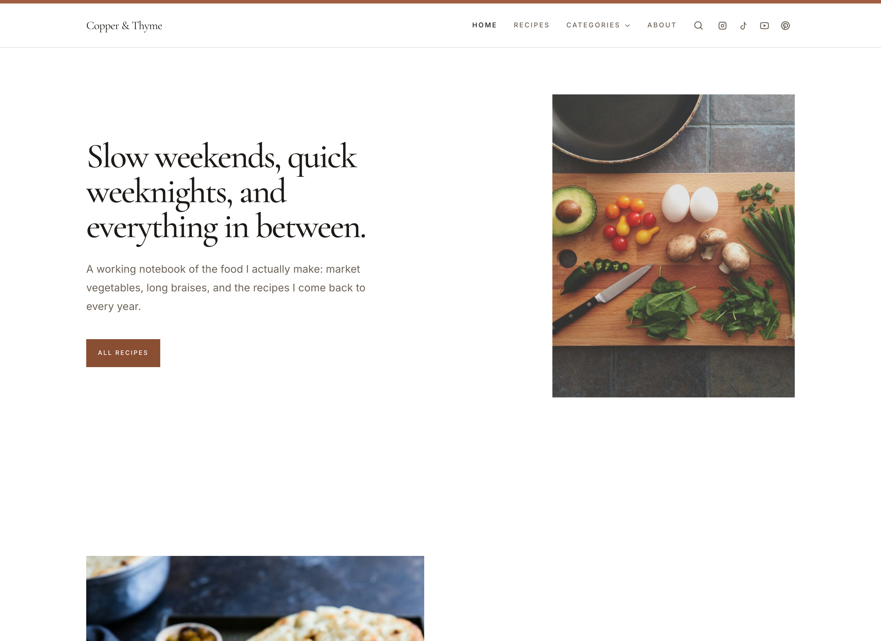
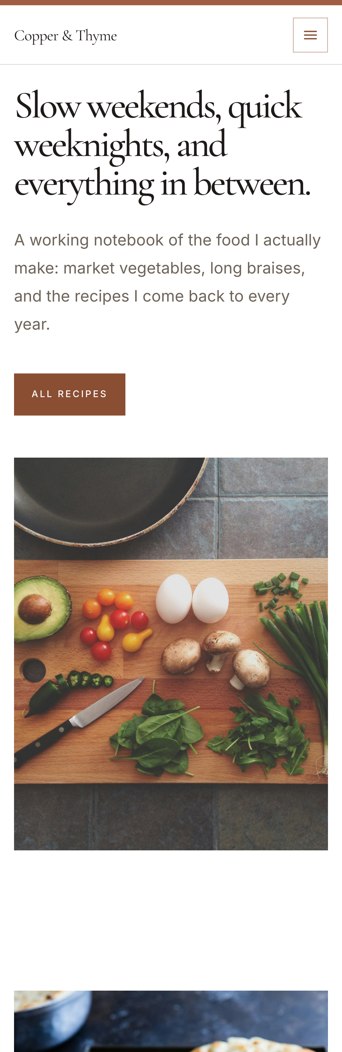
Vanilla was designed around the observation that recipe sites rarely need more design — they need less of it competing with the food. Everything here is tuned to stay out of the way: a true white canvas, warm cream section bands, a muted clay accent, and square edges that never draw attention to themselves.
Headings are set in Cormorant Garamond, a serif with enough contrast to feel considered at large sizes, paired with Inter for body text and interface labels so ingredients and instructions stay easy to scan on a phone in a kitchen.
The homepage reads as a single quiet sequence: a hero image, your most recent cooking, a way into your categories, an introduction to you, and an invitation to subscribe. Recipe search sits in the header rather than interrupting that flow.
What defines it
- Airy by default
- Generous section spacing and a standard content width that keeps line lengths comfortable on large screens.
- Serif display, sans body
- Cormorant Garamond headings give the page a voice; Inter keeps ingredient lists and steps legible at small sizes.
- Search in the header
- Recipe search is always one tap away without taking a slot on the homepage.
Who it suits
- Creators whose photography is the main draw
- Anyone who wants a considered default without configuring anything
- Publications mixing short weeknight recipes with longer writing